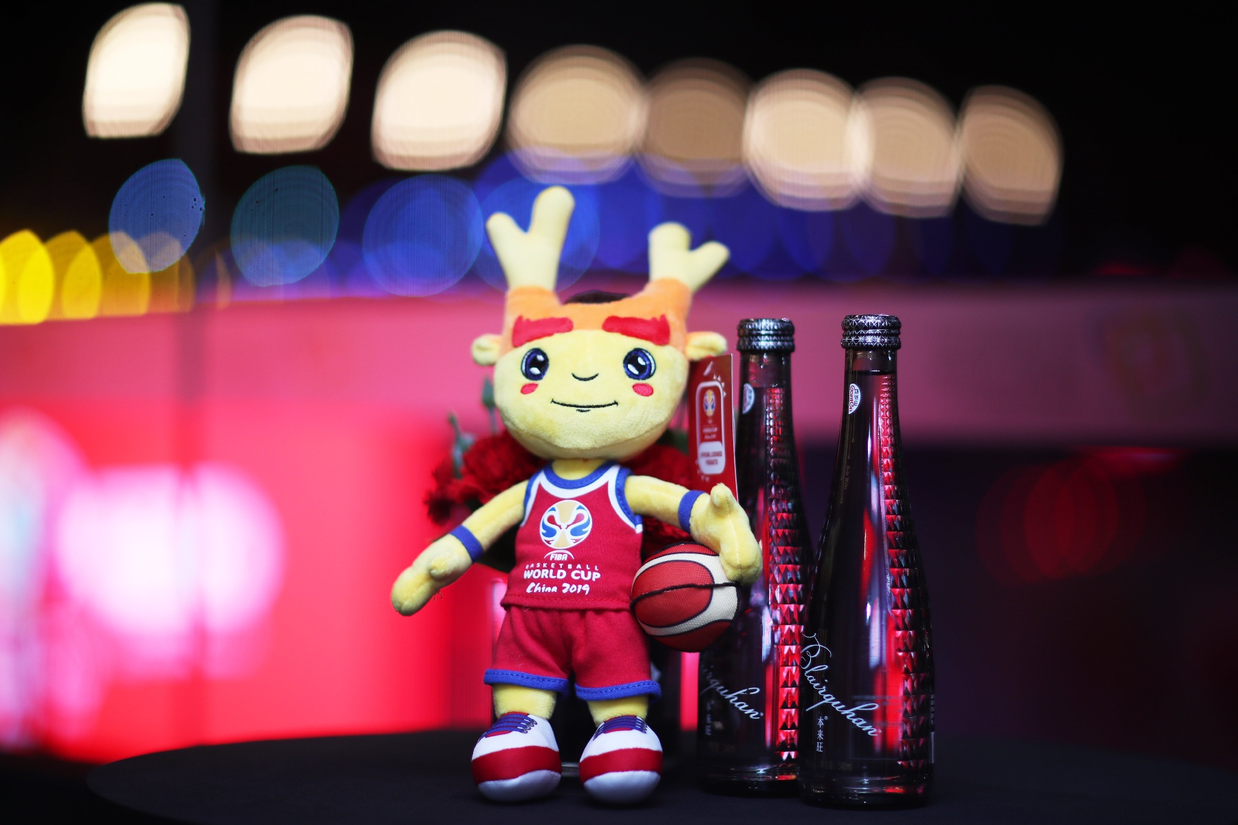
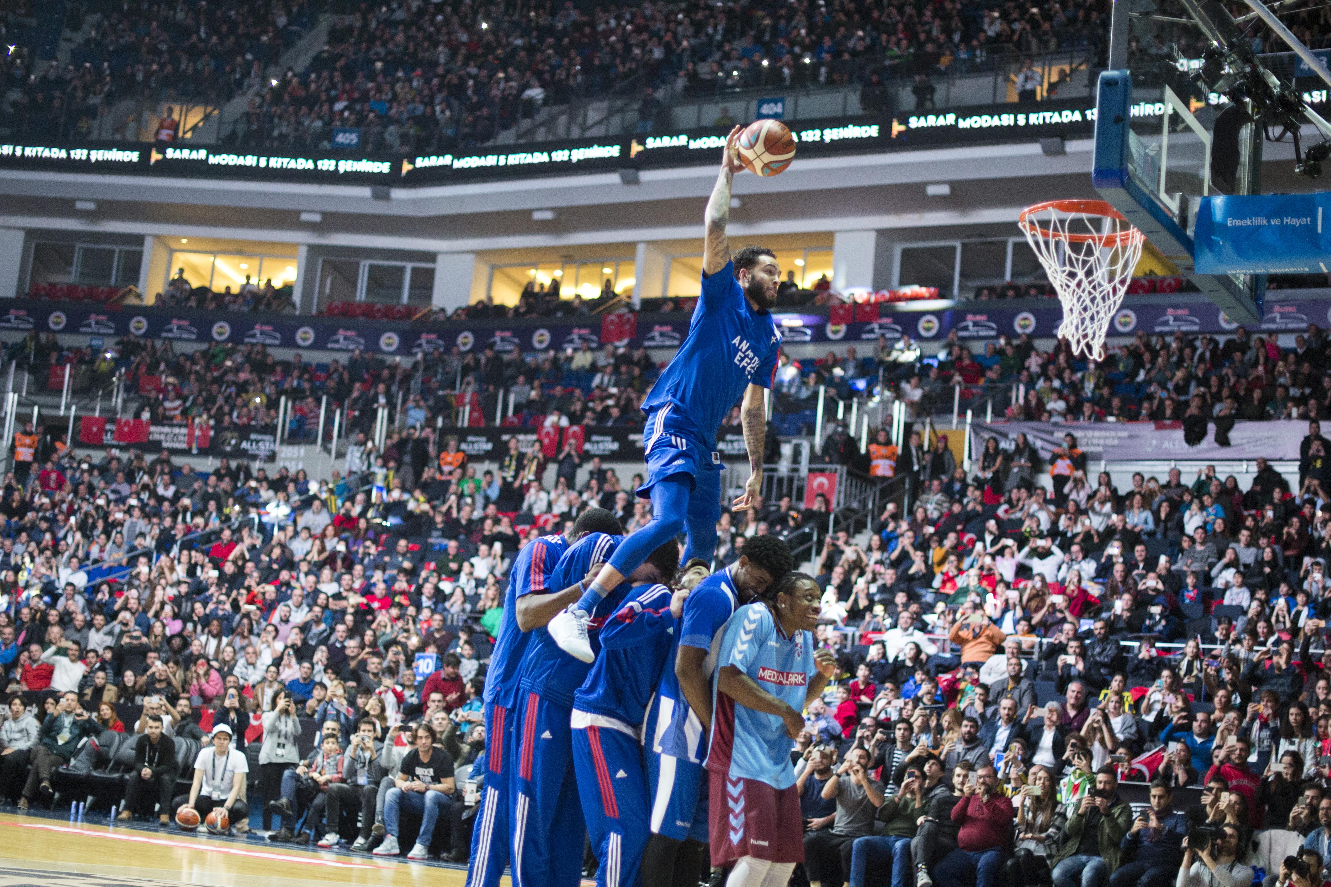
Skip to content
Blog

Branding basketball – How hosts help to reflect look of FIBA events

Infront
18/04/2018
4 min read

Building a brand is a marathon, not a sprint. It is so much more than just the launch of a logo. The fact that it needs to be reflected in every essence of an event is a subtlety that not every fan or stakeholder instantly recognizes when it is there, but one that becomes more apparent when it is not there.

The main aim for any event when it comes to building a brand is to be able to create elements that translate the uniqueness of each host country. Every host wants to highlight the positive values it has as a country, and so it should. With sport celebrated on a global scale, hosting a major event has often been cited as one way to draw tourism and business, providing a boost for the local economy. The right brand can drive that.

The general challenge in creating brand identity for events is to ensure that an authentic story is created through visual language. It needs to “speak” to the fans whilst also meeting requirements from all stakeholders, not only the hosts, but also the media and commercial stakeholders.

However, with hosts and stakeholders often focused on local details, it takes some effort to translate their message on a global scale. Understanding the different requirements and values that need to be incorporated in each brand identity, as well as how the brand can engage with fans, has to be looked at from in a holistic sense. This all comes before discussing the creation of graphic elements, typography, slogans, logos and mascots for promotional materials, advertising, venue dressing and merchandising among many other things.

Making the global local

Our work with FIBA began in 2016, but prior to that, FIBA’s marketing team developed an entirely new brand architecture to ensure consistence, increase brand awareness among all the tournaments, and align with the competition system launched by FIBA.

This new brand included a consistent FIBA hoop, providing a badge of authenticity for FIBA events and, as part of the brand revamp, included new trophies for the FIBA Eurobasket, Afrobasket, Asia Cup, AmericaCup and the FIBA Basketball World Cup.

The brand already helps structure how logos are developed, as the trophy is the central theme. Sport at this level is all about winning, and reflecting the glory of lifting a trophy at the end of the competition has been central to every tournament thanks to the successful implementation of the brand.

That consistency has been carried through 10 major international events in 2017, and will be delivered for three international events in 2018.

This has also included the implementation of the brand for the FIBA Basketball World Cup 2019, including the Qualifiers, which started in November 2017. The latter has been the biggest challenge with brand materials delivered to 80 countries around the world.

Next year is now

Unsurprisingly, even though there are now less than 500 days to go, work began on the FIBA Basketball World Cup 2019 a long time ago.

China is a country steeped in basketball tradition, so the promotional activities require the correct brand to familiarise the market with the tournament early on.

The official logo was launched in March 2017, the brand development is in progress and the first phase has already been delivered. Part of that included the public contest to design and name the official mascot. Launched last December, there were hundreds of submissions.

An expert panel composed of FIBA and the Local Organising Committee then had the unenviable task of picking a top 10 and then three finalists.These were put to the public polls, with 93% of votes coming from China, truly helping engage the local fans more than a year out from the tournament itself.

And, as announced on 18 April, Son of Dreams was the eventual winner.

A global brand campaign is currently being evaluated in order to link all the promotional activities planned and aligned with the Chinese flavour. That is a challenge in itself, but a welcome one. With a country so deep in culture, it should provide many opportunities to bring a unique look and feel to the tournament. Because, the logo and mascot are just the start.

"The perfect metaphor"

Whilst the FIBA Basketball World Cup 2019 is currently in the news agenda, the FIBA Women's Basketball World Cup 2018 is a good example of how brand reflects host, and gives a good idea of what to expect for the men's event next year.

The brand shows basketball from an all-new point of view, illustrating the different depths and heights thanks to inspiration from the impressive natural landscape of the Canary Islands - and Tenerife in particular.

<<Watch Video>>


Mount Teide was central to this, the perfect metaphor for the 16 teams that will take to the court.

Much like the volcano - which emerges from the Atlantic Ocean to stand as Spain's highest point at 3,178 metres - all participants in the FIBA Women's Basketball World Cup 2018 will compete to rise to the top and be crowned world champions.

The seven islands of the Canary archipelago are also represented by special human elements, as the athletes that emerge for world-class performance.

"Representing the future of the sport"

Argentina's flag was the starting point for the FIBA U17 Basketball World Cup 2018 brand, with the logo including two hands reaching up at the tip off point, which represents the two blue stripes of the Argentinian flag. The ball then loosely represents the sun.

There is a real sense of journey with the flowing hands, and with the sun the closest star to earth, it helps add an extra layer of storytelling, with these bright young stars set to be the next big players representing the future of the sport.

"Rich pickings from a rich culture"

With a rich cultural heritage and vibrant natural beauty, characterized by an abundance of rivers, lakes and forests it was not hard to find a brand visual for the FIBA U17 Women’s Basketball World Cup 2018 in Belarus.

<<Watch Video>>

It is a country with distinct symbols that are so iconic they appear in the country's flag.

Both the style of the logo and brand visuals display a colourful, youthful and versatile design that reflect these national features, bringing flavour and excitement to the event before it has even begun.

Whilst the creation of the design may exercise the creative side of branding, it is only half of the job. For without implementation, brand design cannot be appreciated.

Work on ensuring the brand materials are produced correctly and sent to the venues begins months in advance, with a collaborative effort between host and agencies. There are just a few days before the event to verify the quality of the material and oversee the installation both inside and outside the venues.

And the work does not stop once first tip-off takes place. There are constant adjustments needed in the arena, with additional material also necessary.

As I said, it is a marathon, not a sprint…