On the surface the latest rebranding of the Four Hills Tournament looks to have taken very little time. Simply take the current logo, change the colour to reflect the cold palette of winter and create a more uniform font.
However, as with most tasks that are made to look simple, months of thought and conceptualizing went into how the look and feel of one of ski jumping’s flagship tournaments should reflect the four events themselves.
“Infront was part of the last rebrand almost 11 years ago, it was one of the first tasks we did when we began our partnership with the event,” says Infront’s Magdalena Schweighofer, who led the rebranding project. “At that point in time, the aim was to have four colours to represent the four different venues – two in Germany, two in Austria – and allow for a degree of individuality.”
Since then, however, the outlook has changed, with the four venues keen to align on colour and provide the best possible platform for sponsors.
“It wasn’t about re-inventing the wheel, which is often the case for a rebrand,” adds Schweighofer. “This time it was about finding a fresh look to ensure all partners – specifically our media and sponsorship clients – could associate themselves with a modern brand. There was also a necessity to have a uniform appearance which changed two important main features of the logo. The colour - which changed to blue to reflect winter – and the lettering which strengthens the Four Hills Tournament more with the focus is no longer on the ‘Four’.”
Work on the project began in September 2020, with various designs presented to the four organising committees as well as the Austrian and German Ski Associations at the spring conference in 2021. Once the base design was decided, it was then a case of ensuring all stakeholders were happy with the direction the brand was going in.
The Four Hills Tournament collaborated with Infront and consulted its presenting sponsor Bet-At-Home as well as the International Ski Federation and several broadcasters. This was to ensure they had enough time to adapt and implement all of the changes ahead of the 70th anniversary of the event. As keen as everyone was to roll-out a new brand, it was vital to have all parties happy with what was presented.
The colour blue was a unanimous decision by nearly all those involved, due to its association with the cold winter months, and as there were only slight changes to the logo itself the discussion mainly centred around the updated font.
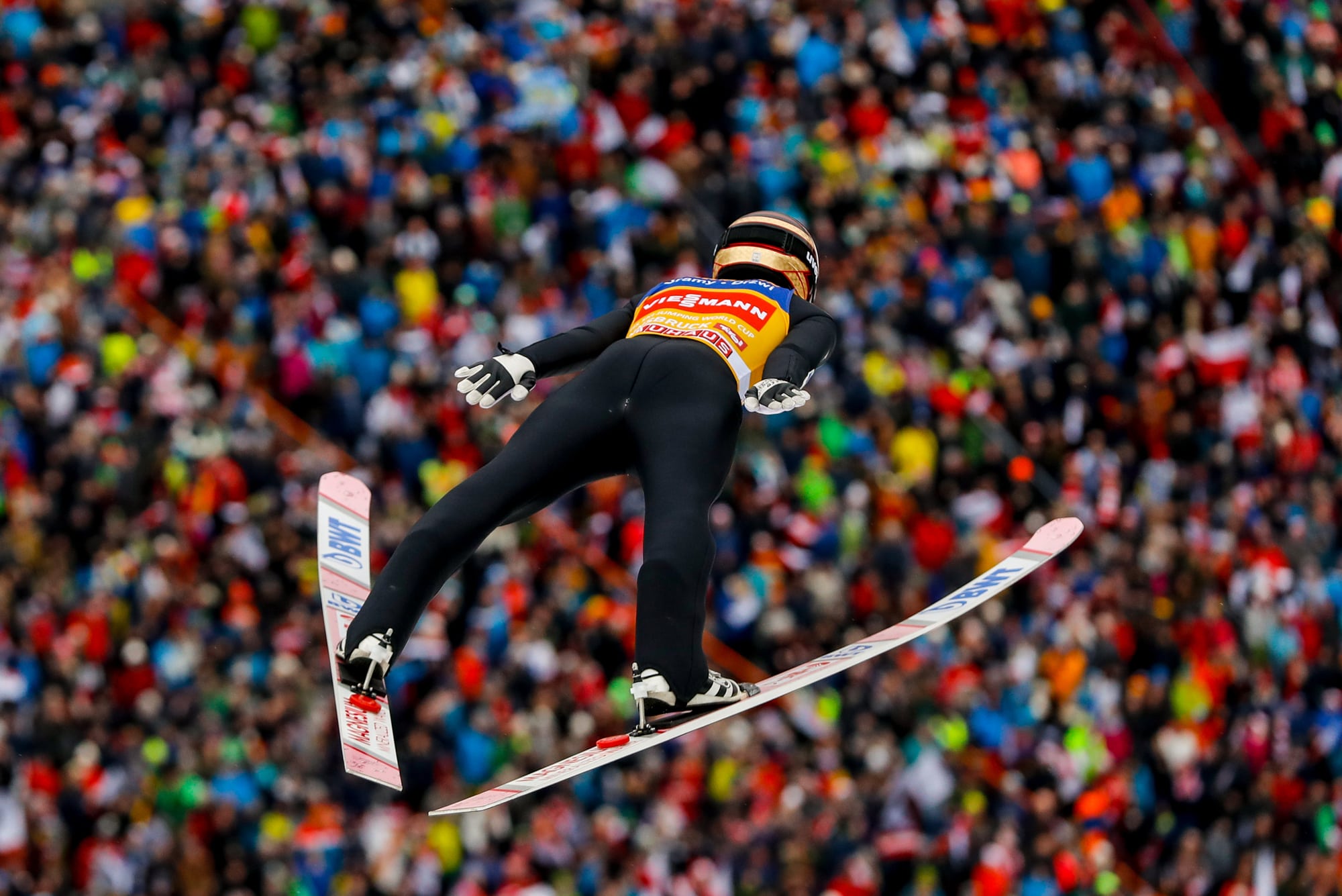
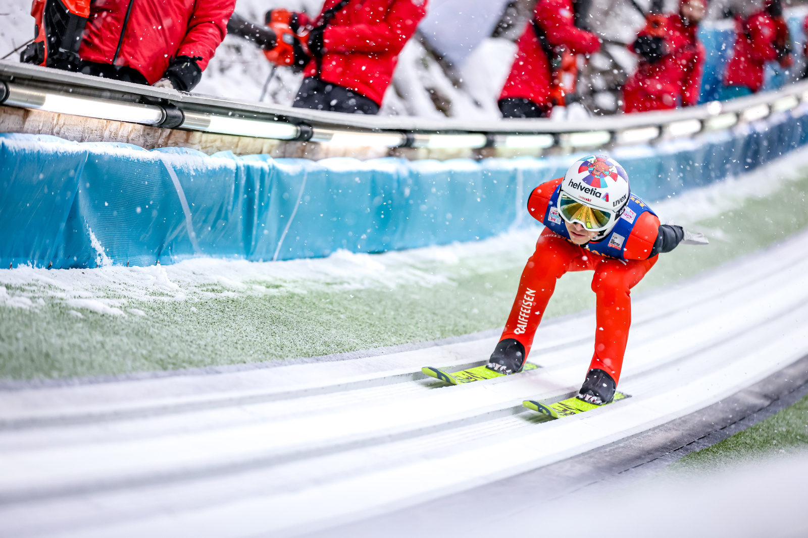
“We actually looked at the shapes of a ski jumper as they are flying through the air as a starting point,” explains Schweighofer. “From many angles, the shape of the skis are actually a ‘v’, so naturally we wanted to try and incorporate that into the font. That’s where the ‘v’ and ‘a’ comes from. The shape is also the movement of an eagle’s wings, and as the jumpers are often referred to as flying eagles, and the bird is included on the trophy, it created an almost perfect link between everything we were trying to achieve. As a result, we are also using these sharp angles on most of the brand elements.”
The rebranding was officially unveiled in September 2021 and Tournament President Dr. Peter Kruijer emphasised that with the "new corporate design, we are once again underlining our claim to leadership in winter sports and strengthening the Four Hills Tournament brand.”
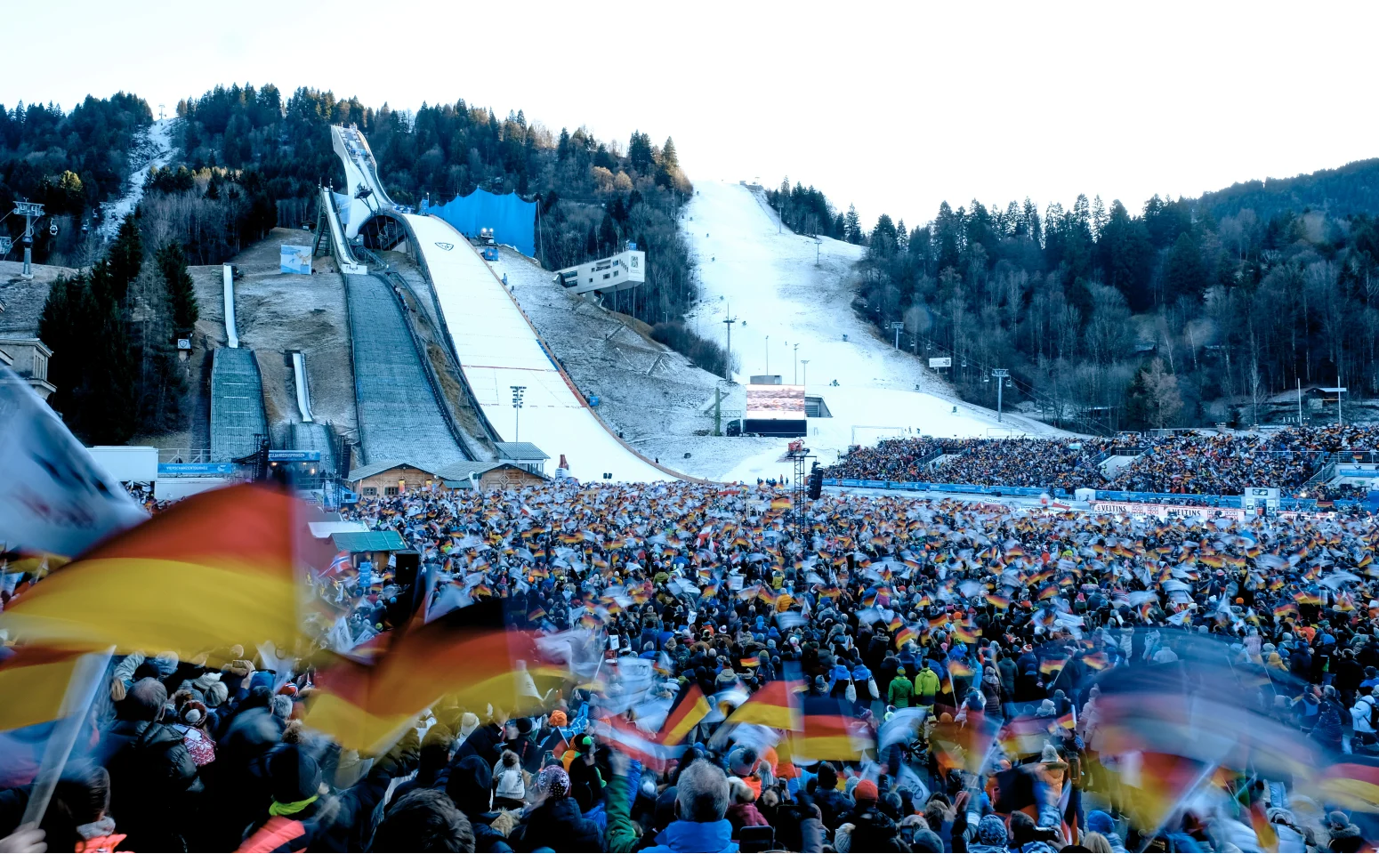
The new brand will be seen by millions of fans who switch on to watch the Four Hills, with new signage, banners and flags brandishing the new look and feel. Updated broadcast swipes will also be used, with TV motion graphics, slow-motion wipes and 3D venue renderings also reflecting the updated brand.
Despite some initial challenges, it was hugely encouraging to deliver this new brand, adding to the legacy of the Four Hills Tournament.